Creating a Halo Ring Slider in CSS and JavaScript

Recently, I was given a design to build which called for a circular slider of product images arranged in a tilted ring spinning around its center. The featured product is displayed in the center while the other products are evenly arranged around the circle and get smaller as they recede into the background.
As I idly searched for a pre-existing solution, I started having ideas on how I would go about making such a thing on my own. So, in my spare time I started tinkering with the idea.
The First Approach
My initial thought was to have CSS 3D transforms do the heavy lifting. A circular <div> is given a rotation to tip one edge closer to the user—think of holding a plate in front of you with the closest edge tilted slightly down.

.halo-slider--ring {width: 100%;aspect-ratio: 1 / 1;border: 4px solid #333;border-radius: 50%;transform: rotate3d(1, 0, 0, 70deg);}
Next, each item in our slider is spaced evenly around the edge of the circle. The position of each item is calculated with some trigonometry, and we figure out how far apart to space them in degrees by dividing 360 by the number of items. We can then find the point along the circle:
function getCirclePosition(radius, index, itemCount) {const degree = index * (360 / itemCount);const y = radius * Math.cos((Math.PI * 2 * degree) / 360);const x = radius * Math.sin((Math.PI * 2 * degree) / 360);return [x, y];}
Lastly, the whole thing is rotated around its center point to display the active item in the closest position to the user.
Why the First Approach Didn't Work
Compound 3D rotations in CSS are complicated to the point that this idea isn't really feasible. The issue is that we have to rotate the circle to tip it forward, but then we also need to rotate it around the y axis to switch the items. This means that we have to rotate the slider around two separate axes at once which you can't do this with CSS transforms. What you can do is calculate a vector that is the average of both needed rotations, and while in theory would work, it is a bit much for this application.
This problem becomes more complicated since each item around the circle also needs a compound rotation so that they are always right-side up and facing the user. To make this work, we would need to calculate a complex vector for the rotation on each child to exactly offset the complex vector for rotation of the parent. No thanks.
The Second Approach
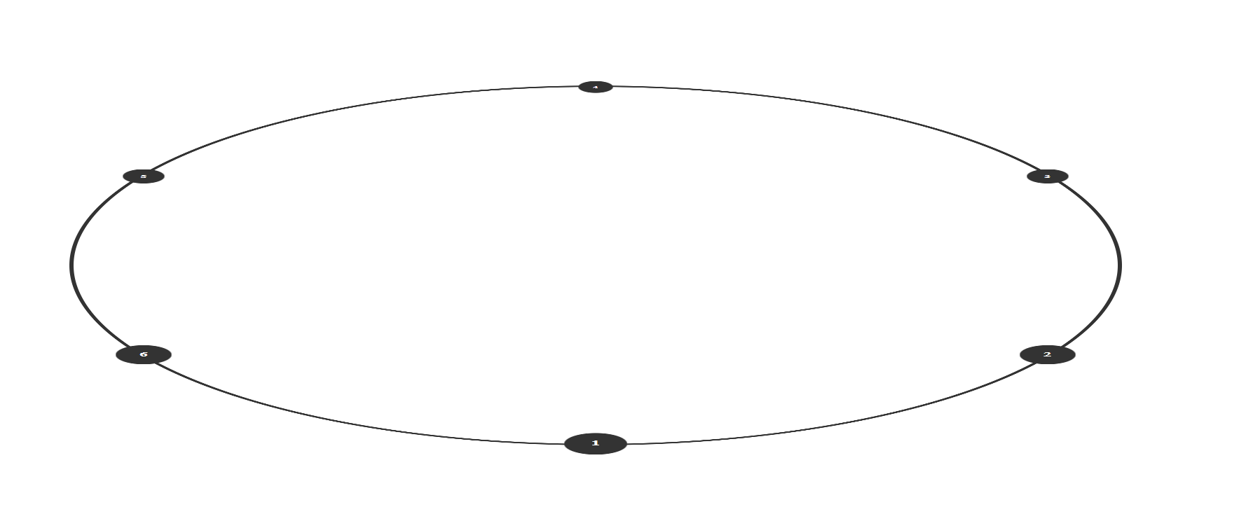
Luckily, I thought of another approach. Instead of a 3D tilted circle, we can get a similar, though not exact, effect by taking a circle and squishing it into an ellipse. Then we simply need to rotate the ellipse around one axis.
In this approach the children need some special care. Firstly, they still need to be offset so they remain upright at all times, but this is simply done by rotating them in the opposite direction of the parent. If the parent is rotated 60 degrees we rotate the children by -60 degrees.
Next each inactive child item needs to recede in size as it move backwards around the circle to create the impression that it's moving away from the user. This is done by setting the scale of the item (using a CSS custom property) in reverse proportion to its y position in the div. So items higher up appear further away.
updateScale(radius, yPos, item) {let newScale = 0.35 + (yPos / (radius * 2)) * 0.65;item.style.setProperty("--scale", `${newScale}`);}
Notice in the scale we start with a scale of 0.35 which is the smallest our item will get. To this we add our y based calculation performed on the remaining 0.65.
We also need to make a change to how the point along the ellipse's circumference is derived. Mainly, for an ellipse we need to account for both the horizontal radius and the vertical radius.
function getCirclePosition(radiusX, radiusY, index, itemCount) {const degree = index * (360 / itemCount);const y = radiusX * Math.cos((Math.PI * 2 * degree) / 360);const x = radiusY * Math.sin((Math.PI * 2 * degree) / 360);return [x, y];}
Note that for the final example things have been abstracted a bit more to use class properties and we calculate the point using radians instead of degrees.
Conclusion
Using this method, I was able to create a product halo slider which can handle any number of items that rotate along the circle (now an ellipse) and recede into the background as they do so.
Check out the Halo Slider on GitHub.
Here's a finished example on CodePen.